Jul 21, 2026-Reviews
ScreenSnap Pro Review - The One-Time Screenshot App for Mac & Windows
We've tested ScreenSnap Pro, a one-time-purchase screenshot and GIF app for Mac and Windows that turns plain captures into designed visuals, annotates them, and shares them in seconds.
Welcome to this ScreenSnap Pro review ✨
Every screenshot you drop into Slack, a doc, or a landing page is a tiny first impression, and the macOS and Windows defaults make it a plain one: a bare rectangle with a hard edge, no padding, nothing that says a person with any taste was involved. The usual fix is one of the slick subscription tools, lovely software in its own right, but one more monthly charge on a pile that never seems to shrink.
ScreenSnap Pro goes after both problems at once. It's a screenshot app for Mac and Windows that turns a raw capture into something that looks designed, and it does it for a one-time $29, with no subscription, ever. The tagline is blunt about the goal: "From capture to share in seconds."
Morgan, the maker, asked me to look hard at a specific set of things: the 160+ gradient backgrounds, the screen-to-GIF recording, the 15 annotation tools, the OCR text extraction, the optional cloud sharing, and the little workflow touches (Quick Access Overlay, Pin Screenshot) that are supposed to keep you in flow. So I installed it on my Mac, granted it the permissions it asks for, and ran a stack of real captures through it. Here's what I found.

Getting Started & First Impressions
Setup is a short, honest onboarding. ScreenSnap walks you through the macOS permissions it needs and, refreshingly, tells you why each one matters: Accessibility so the global shortcuts fire anywhere, Screen Recording to actually capture, Microphone for recording audio, and Camera (clearly marked optional) if you want your webcam in a recording. No dark patterns, no pre-ticked boxes.

Then it hands you three default shortcuts: ⌘⇧1 for a quick capture straight to clipboard and file, ⌘⇧2 to capture and drop the result into the editor, and ⌘⇧G to start a recording, and every one of them is remappable. Hit ⌘⇧2, drag a region, and the editor opens with your capture already sitting on a background, corners rounded, a soft shadow underneath. A left rail keeps Image, Video, Library, and History one click apart; a top bar holds presets, OCR, crop, zoom, copy, and save. It feels less like a screenshot utility and more like a tiny, focused design app.
Beautiful Backgrounds: The One-Click Glow-Up
This is the headline feature, and it earns the billing. The interesting decision is that ScreenSnap applies a background by default. Your capture is already framed the moment it lands, so the "designed" look is the starting point, not a chore you have to remember.
The right panel gives you four background modes: Wallpaper, Gradient, Solid, and Transparent. Wallpaper is the 160+ library, sorted into signature collections (Energy, Midnight, Radiant, Iridescent, Spring, Sunset and more), so you're picking a mood, not scrolling an undifferentiated grid. Gradient lets you build your own: choose two colours, set the angle (mine defaulted to 135°), or grab a ready-made one from the Simple, Vivid, or Radial families. Solid and Transparent are there for when you want the capture to sit cleanly on a doc or a coloured section.
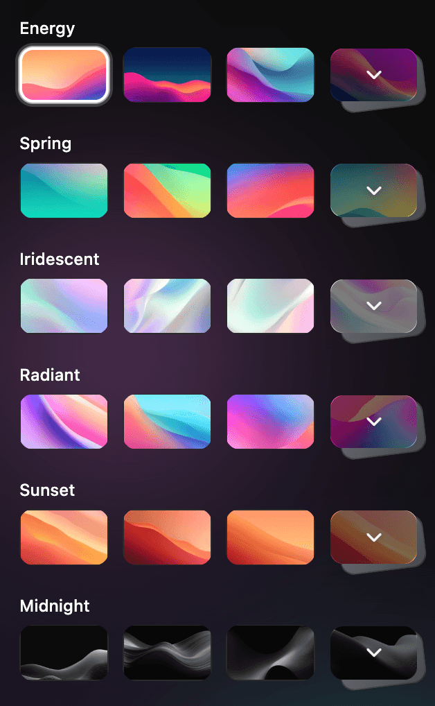
Around the background you get the fine controls that separate "screenshot with a colour behind it" from "this looks intentional": a Margin slider for breathing room, a corner style (Sharp / Rounded / Round), a shadow (None / Spread / Fit), an inset Framed option, and an aspect-ratio dropdown for sizing to social. I made a plain window capture look like a product-page hero in about four clicks, and none of them required a design bone in my body.
Annotate Like a Pro: Fifteen Tools, One Keystroke Away
The annotation set is genuinely deep. The shape picker alone holds an arrow, a rectangle and a filled rectangle, an ellipse and a filled ellipse, a line, a polygon, a blur and a pixelate tool for redaction, a freehand pencil, and a spotlight that dims everything but the region you care about. Add the text tool, the highlighter, a counter for numbered walkthrough steps, and emojis, and you're at the promised 15.

What makes it feel professional rather than fiddly is the surrounding chrome: a colour control, a stroke-width slider, a Sharp-versus-smooth style toggle, and undo/redo, all inline above the canvas. The blur and pixelate tools are the ones I'd reach for daily. Dragging a box over an API key or a customer name and having it disappear cleanly, with no trip to Preview or Photoshop, is exactly the kind of small friction a paid tool should remove.
Screen Recording & GIF
Morgan's own framing here is "screen straight to GIF, with no video conversion step," and that's the useful part. ⌘⇧G records a region, a window, or the full screen, with webcam and system or microphone audio, and you export the result as a lightweight GIF or a video, with no separate converter and no second app. For bug reports, quick walkthroughs, and the kind of "here's what I mean" clip you paste into a thread, the GIF export is the star, and it's a real answer to standalone GIF recorders and the screen-recorder-for-Windows crowd too.
One honest note from testing: the video side lives behind a tab still labelled BETA in the app, so it's clearly newer than the screenshot tooling. Treat the polished, mature part of ScreenSnap as everything around still images; the moving-picture features are catching up.
OCR: Copy Text Out of Anything
A one-click OCR button sits right in the editor's top bar, and it does the obvious, valuable thing: point it at any capture (a screenshot, a slide, a locked PDF you can only screenshot rather than select) and it lifts the text out as clean, copyable content. It's the sort of feature you forget exists until the one afternoon it saves you retyping a paragraph from an image, and then you never want to be without it.

Cloud Sharing: Optional, and It Means It
Turn cloud on and the loop is exactly as advertised: capture, get a short shareable link, paste it into Slack, Discord, or an email. No attachment, no download on the other end.
The word worth stressing, and Morgan stressed it to me, is optional. ScreenSnap works fully offline; the cloud is a toggle you can switch off entirely, and when it's off your captures never leave your machine. For anyone who deals with client work or sensitive material, that "local by default, cloud only if you ask" posture is the right one, and it's paired with clean, watermark-free output on every export.
Everything you capture also collects in a Library (images, screen recordings, and GIFs in one place), where each item shows its size and dimensions and gives you one-click actions: reopen it in the editor, grab a share link, or drag it straight out into another app.

The Rest of the App
A few smaller things round it out and are worth knowing about:
- Quick Access Overlay: your fresh capture pops up in a floating overlay so you can view, edit, drag it into any app or folder, or share it without breaking stride.
- Pin Screenshot: keep a capture floating on top of everything while you work, which is quietly brilliant for copying a reference while you type.
- Zero watermarks: nothing is stamped onto your images on any plan, so it's safe for client and commercial work.
- Presets, crop, and aspect ratios: save a look you like and reapply it, crop inside the editor, and size to common ratios.
- Library & History: recent captures stay one click away in the left rail.
Pricing & Plans
This is where ScreenSnap plants its flag. There are no tiers, no "Pro" add-ons, and no feature gating: you pay $29 once and get the entire app.
That one purchase includes two licences, and each licence activates on two computers, so one payment covers up to four machines, and you can mix Mac and Windows freely. Every future update is included forever, with no upgrade fees. It runs on macOS 15.0+ (both Apple Silicon and Intel) and on Windows.
The pitch against the category is simple arithmetic. Most screenshot tools charge somewhere around $29 to $39 per year, and you lose access the moment you stop paying. ScreenSnap is $29 full stop, which means that after roughly eight months you're already ahead, and you never see a renewal charge. That makes it a genuine alternative to the subscription screenshot tools for anyone whose main objection is, well, the subscription.
One thing to set expectations on: there's no trial build to download, so you buy it up front. That's softened considerably by a 30-day money-back guarantee, no forms and no retention call, so in practice you can run it on real work for a month and walk away for a full refund if it doesn't fit.
Who Should Use ScreenSnap Pro?
It's a strong fit if you are:
- A maker, designer, or developer who shares screenshots all day and wants them to look considered without opening a design tool.
- Anyone tired of stacking subscriptions (a snipping tool for Mac, a GIF recorder, an OCR app, a cloud uploader) who'd rather pay once and own one app that does all of it.
- A Windows user who has watched the nicest screenshot tools ship Mac-only.
It's less essential if your workflow leans on things ScreenSnap doesn't do yet. There's no scrolling or long-page capture, no deep video editing, and no shared team libraries. If any of those is central to your day, it's not a one-to-one replacement, at least not today.
Conclusion
That's the end of this ScreenSnap Pro review. What I appreciate most is that it has a clear point of view: screenshots are a first impression, subscriptions are exhausting, and you shouldn't need both a design app and three utilities to share a good-looking capture. It backs that up with a genuinely deep editor (backgrounds, framing, fifteen annotation tools, OCR) and a price that undercuts the whole category over any reasonable horizon.
If plain screenshots and monthly charges both annoy you, ScreenSnap Pro is well worth the one-time $29.
What I liked:
- One-time $29 with no subscription, genuinely rare in a category built on recurring fees.
- Backgrounds make a plain capture look designed in a click, with real framing controls behind them.
- Fifteen annotation tools, including blur and pixelate for redaction, a step counter, and a spotlight.
- OCR built right into the editor.
- Cloud is truly optional, and it works fully offline.
- Mac and Windows, when much of the competition is Mac-only.
Things to keep in mind:
- There's no trial download; you buy up front, with a 30-day money-back guarantee as the safety net.
- Screen-to-video sits behind a tab still marked BETA; the still-image side is the mature part.
- No scrolling or long-page capture yet, so it isn't a full swap if that's a job you rely on.
- It requires macOS 15.0+ (Apple Silicon and Intel both supported).
Grab it once and stop paying rent on your screenshots: ScreenSnap Pro.
Related Articles